
Chapman and Rodden coined the term Minimally Technical Reporting, describing how “Good reports are short, focused on action, minimally technical, and unbiased”1. This is my core philosophy behind how to structure UX research communication for stakeholders.
When we start out as researchers, we work in an operational plane. We are executing all of the details and sharing those out to other more senior researchers. They want to know the study design in great detail. The stakeholders we work with tend to be designers or product managers that are close to work at hand. They want each little nugget of insight to glean about the product.
As we become more senior, our stakeholders shift. We check in less frequently with other researchers, or less closely. They may review some details but the trust is higher that the study is properly designed. Our stakeholders become higher level product managers or executives who can’t possibly store every minor insight in their mind, nor do they need to.
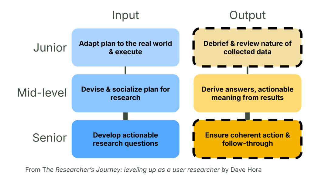
What made a junior-level report useful to those stakeholders starts to work against your goals as a senior. Further, every time you share something about a study or its results, the context changes. Therefore, you need to adjust to fit that context: calibrate your minimally technical report. I am going to lay out my strategy and theory for getting UX research communication right.
The iceberg
The minimum amount of technicality you need in your UX research communication depends on your audience. As you start out writing just for yourself, you can be as technical as you want. With every step further from your immediate team and product area, the information needs to get less dense and clearer at a glance.
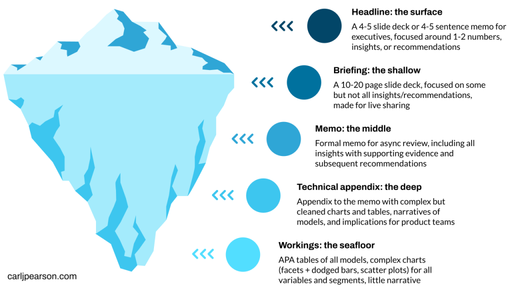
These levels are not strict, I can see arguments for fewer or more. I got to five because that is the number of distinct levels of abstraction I report on for a typical project. I built this understanding from experiences of mistakes and successes along the way. Let’s start at the lowest level to get into more details.
Workings: the seafloor
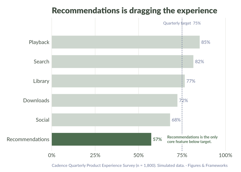
I store my raw-ish information somewhere in my document tabs or subtabs (I use Google docs. Does Word have document tabs yet?). This level is mainly for me alone, so calling it a “communication” may oversell. It’s where I do the sense-making of the results I’ve obtained. It includes exhaustive descriptive charts that never make it up to higher levels. I use them to explore and generate a deeper understanding of the patterns before I start to zoom in.
Things are messy here, and the materials document the process rather than form a cohesive narrative. It’s important to call out this lower working level alongside other communications because having more polished levels doesn’t mean this deep, fluid level of writing is not useful at all.
In qualitative work, this may look more like a spreadsheet of tags or thematic/affinity mapping. I’ve even thought of taking a “mental model” approach in figjam to connect the dots across my plots and tables, but it hasn’t felt more efficient yet than just using a document.
Technical: the deep
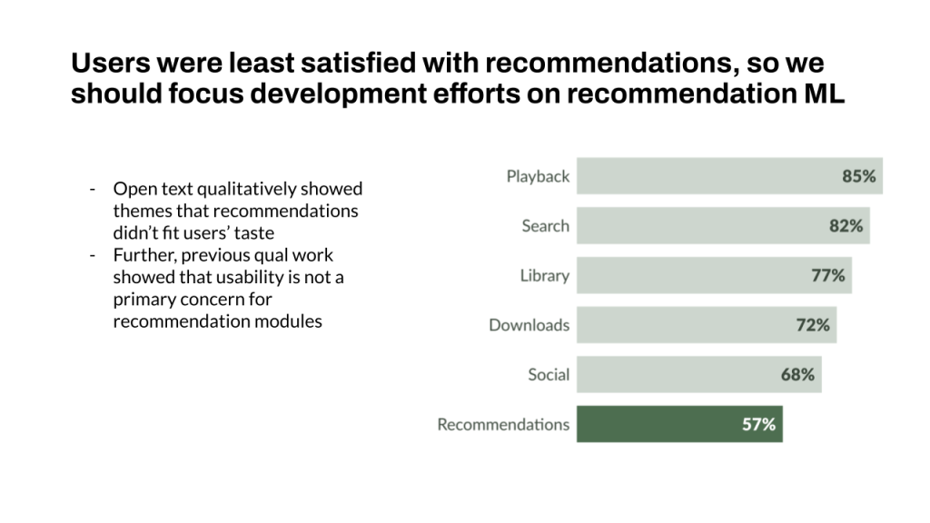
This level is where I become more selective. Information is more ordered and someone other than me wouldn’t have a hard time finding the information they need. I show the models and visualizations that drove the analysis in the final narrative I’m sharing with the team.
I used to think I was writing the memo, but I was actually writing the appendix. Academic training that focuses on showing your work will lead to this style of report. It’s still useful in learning what you need to know, but it’s poorly suited for sharing with stakeholders.
I write the technical appendix first, getting all of my thoughts out. Then, I start to trim and simplify into the memo. I did this by accident a couple of times before making this intentional. I’d share my appendix-style document with peers for feedback, and they said “it’s too technical”. I found it easier to start over and write a brand new memo instead. The technical details still felt valuable and worth linking, but the second run memo felt more camera-ready.
This two-stage process from technical appendix to memo now feels natural and deliberate. Making the technical appendix allows me to bathe in the data, like familiarization in qualitative research. The resulting summaries and recommendations in the memo are sharper for it.
Memo: the middle
The memo is how the biggest number of my stakeholders view the data. It has tons of deep links to the technical appendix, but I only mention coefficients in plain terms (users that reported X were 2.5x more likely to be in Y group). If something is mentioned, it’s significant so I’m not sharing p values.
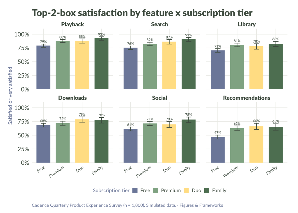
I use charts when they drive the story, but every insight doesn’t need them. All charts here have a point. A bar chart has one bar highlighted where I need readers to focus, or a line chart has annotations to describe its movement.
The memo contains all of the key points I want stakeholders to be aware of, with supporting evidence, and recommendations for what they should do about it. I link to my deeper analysis and past work at the organization that shapes how we should think about it now.
Briefing: the shallow
This level is most often a deck for my work. I used to write deeper dive memos in deck format, but I found they tried to do two jobs at once while failing at both. A deep dive deck is bad for presentations: they’re too text heavy and too detailed for the venue. It also isn’t great for stringing together for complex thoughts in the way paragraphs with footnotes and deep links can be in a document-formatted memo.
The deck here is around 10-20 slides. Each slide focuses on one idea (maybe with a sub point) and large visualizations. Include more than three sentences and you seriously risk losing the audience. They should be focused on the visual, your face, and your voice.
I start to cut down from the comprehensiveness of the memo. Not every insight and recommendation makes the cut to the brief level deck. Some are combined for conciseness. Further, there may be a few versions of the deck if the insights stretch across teams.
Slide decks are quick to put together when the information is already cleanly organized in a memo. As a horizontal researcher, my work often stretches across different pillars. I avoid taking up time in a live presentation for team A with findings that are only relevant for team B by scheduling readouts separately and adjusting the deck as needed.
For some stakeholders, even 10 slides is too many.
Headline: the surface
The headline I share with VPs and executives is the tip of the iceberg. I may have built a generalized linear mixed effects model with non-response bias weights and sandwich estimators for the standard errors. That is way down at the seafloor. The only thing the executive will see is a fully interpreted statement in plain language. Users that do X are 3x more likely to be satisfied than users who do Y, or 23% of users think Z and that is less than we need to be successful. They don’t need to see everything underneath. Executives don’t have time for it and don’t operate at that level.
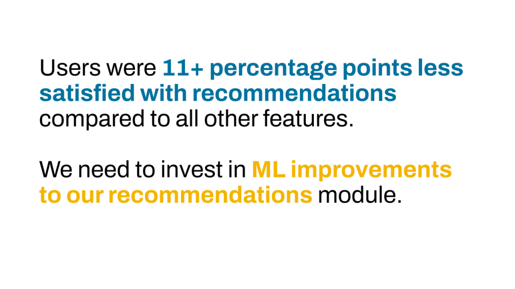
If you show a table to executives, you’ve gone too deep. If you show a dodged or stacked bar chart to executives, you’ve gone too far. I truly believe you’re not ready to talk to executives about your work until you can do it with one number per slide maximum or no numbers at all. Sure there are exceptions, but at this altitude, you need to be ruthless in your simplicity.
At Meta, I showed a driver analysis chart to an executive PM, with fully-labeled X (weighted satisfaction top 2 box percentages) and Y (regression coefficient) axes of course. Execs are great question askers so he said in reference to the regression coefficient axis, “what do these numbers mean concretely?”.
I learned two things in that meeting. The first is to always be ready to explain every number in your deck in plain terms on the spot. I stumbled and ultimately failed to give a decent answer for what the regression coefficient meant during that call.
The second is that you should expect an executive to ask you about any possible detail on your slides, no matter how minor. If you keep that last point in mind, you’ll find yourself naturally cutting out information that isn’t relevant to executive stakeholders. Think to yourself, do I want to be asked about about this or will it derail the 5 minutes I have to make a point?. You should still know your methods, but with only a few moments, you don’t want the conversation to derail.
That was a hard lesson in the moment, but ultimately showed me the value of focusing the conversation narrowly for higher level stakeholders.
Wrapping up
You can be successful in your UX research communication by understanding the underlying principles. The main principles I keep in mind are:
- The higher up the org chart you go, the less information you should present.
- Use the right format for the right context (decks for presenting, docs for reading).
- Of course some stakeholders demand a certain format, and it can be best to roll with it for them.
- Most people don’t care about how you got your answer. Some don’t care about your answer, they just want to know what they should do next.
- The chart that helps you understand the data isn’t necessarily the chart that will help your stakeholder understand what you learned.
The way you implement the details of your UX research communication will be very organization dependent. Whatever you do, it’s important to be highly intentional about the approach you take to communicating your work. That communication is the first catalyst for influence impact, the element researchers are judged on.
Appendix
- Quote taken from Quantitative User Experience Research: Informing Product Decisions by Understanding Users at Scale by Chris Chapman and Kerry Rodden, 2023. ↩︎