Survey weights are a useful tool in a researcher’s tool kit to account for selection bias and accurately generalize results to a population of users. Read my previous post to learn more about why you should use survey weights generally in UX research. That article goes over multiple approaches and strategies for weighting at a high level.
This article will focus on using post-stratification weights (in R) to weight match the responding sample to the population. I’ll create the design weights and non-response weights in a single step. This procedure is possible because (a) our population is the same as our sampling frame and (b) we know the data for our weighting variables on the entire population at an individual level.
Scenario
Imagine that the team wants to track their version of the single ease-of-use question (SEQ)1 for an order creation flow in an online grocery ordering app. This flow’s effectiveness is critical to the company’s top line metrics, so the team wants a high level sentiment metric to ensure the team makes progress on the flow’s user experience (and to use as a guardrail metric).
Historically, the user experience data looks quite different across order frequency (high = >2 order per week, low = <=2 orders per week). Because of this, I’ll weight the data using this key variable.
We obtained 2,500 responses per quarter for our SEQ mean calculations. The team made a large change to the ordering process experience within Q1. Not only does this mean we could expect some shift in sentiment between Q1 and Q2, but it also affected number of users that responded by segment (perhaps due to higher and lower engagement within user segments). Technically, because the population counts vary between quarters, we’ll also weight based on the quarter the data was collected. This gives us two variables to weight by: order frequency group and survey wave/quarter2.
I often use top 2 box scores in bipolar Likert scale data with a conceptual cut off point, so we’ll calculate top 2 box scores as our outcomes variable. (Yes, I know this is controversial3.)
To analyze the data, first we’ll run an unweighted analysis and then a weighted analysis to compare results.
Note: All of the data are simulated based on distributions I created. I also chose the population counts and sampling rates for the sake of example.
Working the scenario in R
Packages and data
To start, we need to load our packages in R. The one doing the heavy lifting for weighting is survey, and then srvyr helps fit it into tidy programming.
Notes: highlighted text is console output in R. For more extensive in-line comment coding, read the full script on github.If you don’t have access to R and want to try it out, get a free Posit Cloud account.
install.packages("tidyverse") # Plots and data cleaning
library(tidyverse)
install.packages("DescTools") # Unweighted binomial CIs
library(DescTools)
install.packages(c("survey","srvyr")) # Survey weighting and analysis
library("survey")
library("srvyr")
install.packages("sjPlot") # Data analysis with regressions
library(sjPlot)
install.packages("here") # Reading in data
library(here)
source("https://raw.githubusercontent.com/carljpearson/cjp_r_helpers/main/cjp_r_helpers.r") # For my plot theme and helper functions

# add colors for theme
mycols <- c(
  "#4d6e50",
  "#7fa281",
  "#55aaff",
  "#6b7698",
  "#8e5b29",
  "#3c6c83"
)
Then we read in the data. I also provide it here for you to download if you want to follow along.
# Load data

df <- read_csv(here("df.csv"))

head(df %>% slice_sample(n=100))

# A tibble: 6 × 4
  Order_Freq   SEQ wave  SEQ.t2b
  <chr>      <dbl> <chr>   <dbl>
1 Low Order      2 Q1          0
2 Low Order      4 Q1          1
3 High Order     2 Q2          0
4 Low Order      3 Q2          0
5 High Order     3 Q1          0
6 High Order     5 Q2          1

df %>%
  group_by(Order_Freq, wave) %>%
  count()

# A tibble: 4 × 3
# Groups:   Order_Freq, wave [4]
  Order_Freq wave      n
  <chr>      <chr> <int>
1 High Order Q1      750
2 High Order Q2     1125
3 Low Order  Q1      750
4 Low Order  Q2      375
For weighting, we also need our population-level data. Since this example only has two variables with two levels, we’ll just create it directly in R. Note that is not a population margin, but a full cross tabs of the data by the 2×2 subgroups. This is important for post-stratification weights (but not so for raking). For post-stratification, the two groups are combined into one variable called stratum.
# Get/create data.frame for population

pop_freq <- data.frame(
  Order_Freq = c("High Order","Low Order","High Order","Low Order"),
  wave = c("Q1","Q1","Q2","Q2"),
  Freq = c(100000,400000,120000,450000)
) %>% # Specify data
  mutate(stratum=paste(Order_Freq,wave)) %>%
  select(stratum,Freq)

pop_freq

        stratum   Freq
1 High Order Q1 100000
2  Low Order Q1 400000
3 High Order Q2 120000
4  Low Order Q2 450000
Unweighted analysis
Now we have all of our data loaded in. Let’s run an unweighted analysis. I use piped text in my code design, as you’ve just seen, so multiple steps will run in sequence.
The general process is to calculate the total N of question responses by our post-stratification groups, calculate the total number of top 2 box responses (e.g.: 1) by those groups, and then plug those numbers into the BinomCI() function. This function calculates a reliable binomial proportion and the proper confidence intervals for binomial data.
#### Analyze data unweighted ####

# Analyze the data
analysis_unweighted <-
  # Start with the dataframe 'df'
  df %>%
  group_by(wave) %>%
  mutate(total = n()) %>%
  group_by(wave, total) %>%
  summarize(n = sum(SEQ.t2b, na.rm = TRUE)) %>%
  rowwise() %>%
  mutate(
    proportion = DescTools::BinomCI(n, total, method = "agresti-coull")[1],
    ci_lower = DescTools::BinomCI(n, total, method = "agresti-coull")[2],
    ci_upper = DescTools::BinomCI(n, total, method = "agresti-coull")[3]
  )

> analysis_unweighted
# A tibble: 2 × 6
# Rowwise:  wave
  wave  total     n proportion ci_lower ci_upper
  <chr> <int> <dbl>      <dbl>    <dbl>    <dbl>
1 Q1     1500   886      0.591    0.566    0.615
2 Q2     1500   818      0.545    0.520    0.570
Tables are nice, but let’s plot it too so we can see the trend.
# Plot the data

analysis_unweighted %>%
  ggplot(aes(y=proportion,x=wave,fill = wave)) +
  geom_bar(stat="identity") +
  geom_errorbar(aes(ymin=ci_lower, ymax=ci_upper)) +
  theme_cjp() +
  scale_y_continuous(labels = scales::percent) +
  labs(y="SEQ Top 2 Box",x='Wave') +
  scale_fill_manual(values=mycols) +
  coord_cartesian(ylim=c(0,1)) +
  theme(
    legend.position="none"
  )
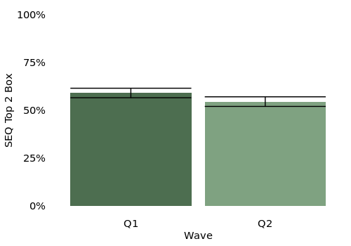
We get our results: the SEQ went from 59.1% to 54.5%. But despite the major change in the order flow, we don’t see a statistically significant drop in the SEQ score inspecting the confidence intervals. The lower confidence interval of Q1 is 56.6% and the upper confidence interval of Q2 is 57.0% – they overlap so we don’t consider them statistically different4.
What would happen if we weighted our data for the top line score we’re sharing out?
Weighted analysis
This is where the survey and srvyr package enter. The survey package is best in class, but is a bit unwieldy to work with – it uses code elements that are non-standard to people like me in the tidyverse. We have to create a “survey object”. This lets us specify the weighting and sampling schema of our dataset. If you create weights in another place (manually or an alternative package), you can still provide those weights to survey.
It’s also important to note that you have to collapse (or paste) your individual strata variables into one combined strata variable. We already did this in our population variables, but we have to do it again for our sample in the third line of our code. (Personally, I got stuck on this odd code package design choice for longer than I’d like to admit).
Because we’re using srvyr we can pipe ( %>% ) in our survey design object creation. We specify ids = 1 to indicate we don’t have a certain clustering structure within strata. The postStratify() command does the heavy lifting of connecting our sampling responses to the target population data. The stratum variable must match in name, and all levels of the variable in the population data must be present in the sample variable. I name my population counts Freq in the population data frame so survey can look for it.
#### Analyze data weighted ####

# Calculate post-stratification weights
survey_design <-
  df %>%
  mutate(stratum=paste(Order_Freq,wave)) %>%
    as_survey_design(ids = 1) %>%
    postStratify(
      strata = ~stratum,  # Specify the stratification variable(s)
      population = pop_freq # Provide the population frequencies
    )

> survey_design
Independent Sampling design (with replacement)
postStratify(., strata = ~stratum, population = pop_freq)
Sampling variables:
  - ids: `1`
Data variables:
  - Order_Freq (chr), SEQ (dbl), wave (chr),
    SEQ.t2b (dbl), stratum (chr)
The survey design object doesn’t give us much on its own, but we build our analysis on that object so the weighted calculation functions can properly access the weights in relation to the data.
We group by wave to compare across survey waves and then call the summarize() function to calculate our means grouped by wave. We don’t just call the regular mean() function, but use the srvyr::survey_mean() function to incorporate our survey weights from the survey design object. We also specify that this is binary data using the prop_method = "logit" argument. (The last line with mutate is for some comparison later).
# Now, use the survey design in your analysis

analysis_weighted_poststrat_1step <-
  survey_design %>%
    group_by(wave) %>% #
    summarize(
      survey_mean(SEQ.t2b, prooprtion=T,
        prop_method = "logit",vartype='ci')
    )  %>%
    rename(proportion=coef,ci_lower=`_low`,ci_upper=`_upp`) %>%
    mutate(
      method="poststrat_1step"
    )

> analysis_weighted_poststrat_1step
# A tibble: 2 × 5
  wave  proportion ci_lower ci_upper method
  <chr>      <dbl>    <dbl>    <dbl> <chr>
1 Q1         0.593    0.564    0.622 poststrat_1step
2 Q2         0.504    0.464    0.545 poststrat_1step
Let’s plot this against our results from the unweighted analysis.
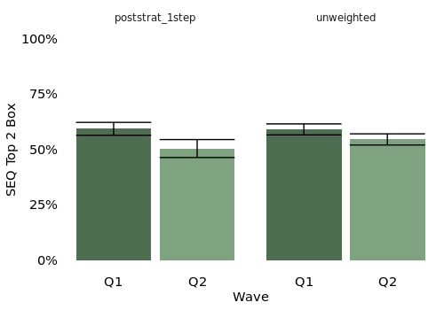
Now we see that the drop in results is actually a significant change across waves. In bars of our plot showing the weighted method, the upper confidence interval of the Q2 is lower than the lower confidence interval of Q1. What’s going on here?
Our population counts are about the same wave to wave, but we had a big shift in who responded, the sample counts. In wave one, both high and low order groups had N=750 responses. In wave two, high order users had N=1125 responses and low order users had N=375 response. Our survey followed a major UX change that we know now negatively affected the low order experience: when we split the groups, the high order frequency users had stayed at 59% for the SEQ. Low order frequency users dropped from 56% in the SEQ to 49%5. This drop in low order user SEQ scores was somewhat hidden in our grand, unweighted mean because we fewer low order users responded (we can imagine due to churn/disengagement from the poor feature change). When fewer users who felt negatively responded to the survey, we underrepresented low order users in the results. This group is perhaps most critical for us to represent in our findings, as they need something fixed to improve their experience.
Without weighting, even with more statistical power a lack of weights gives us, we failed to detect a statistical difference in the population6. When presenting tracking metrics, executives are often primarily concerned with the question did the top line metric go up or down? We want to be sure to get that correct as rigorously as possible. Weighting can control for things like non-response and varying response rates across key user segments that affect the user experience.
Regression models
Let’s go one step deeper than confidence intervals, just to see how you’d do a basic regression model with weighted data. I won’t cover regression assumptions here, as those components stay the same in your code. We need to introduce another package that can handle post-hoc tests in regression models, emmeans.
install.packages("emmeans")
library(emmeans)
We’ll use our same survey design object as we did for confidence intervals, but plug it into a logistic regression function. I mentioned this in the previous article, but it’s important to read documentation for “weight” arguments in R functions. The base::glm function has a weight argument, but it’s a different kind of weight than our survey weights. For that reason we need to use survey::svyglm.
#create model for logistic regression
mod.glm <- svyglm(SEQ.t2b ~ wave,survey_design)

> summary(mod.glm)

Call:
svyglm(formula = SEQ.t2b ~ wave, design = survey_design)

Survey design:
postStratify(., strata = ~stratum, population = pop_freq)

Coefficients:
            Estimate Std. Error t value Pr(>|t|)
(Intercept)  0.59307    0.01479  40.104  < 2e-16 ***
waveQ2      -0.08897    0.02537  -3.507 0.000461 ***
---
Signif. codes:
0 ‘***’ 0.001 ‘**’ 0.01 ‘*’ 0.05 ‘.’ 0.1 ‘ ’ 1

(Dispersion parameter for gaussian family taken to be 0.2460257)

Number of Fisher Scoring iterations: 2

#post hoc test
emmeans(mod.glm, ~ wave) %>%
  pairs()

> emmeans(mod.glm, ~ wave) %>%
+   pairs()
 contrast estimate     SE   df t.ratio p.value
 Q1 - Q2     0.089 0.0254 2998   3.507  0.0005
The formal model with design weights shows the statistically significant change between Q1 and Q2. We could guess at what level of the wave variable is higher and low, but to show the end-to-end process, we use the emmeans::pairs() function to test the difference between levels in wave.
Wrap up
In our example, we saw that using unweighted means failed to detect a statistical difference in the population. Calculating weighted means did properly detect the statistical difference. This dataset was picked to show this outcome for our example. In the real world, there would be many results that are the same between unweighted and weighted approaches. In something like a tracking survey (a great first place to use weighting in UX research), I aim to make the research plan as consistent as possible between waves. It’s impossible to know ahead of time when weighting will make the difference in statistically significant results, so I build it into my tracking surveys from the outset.
My example was one of the most common weighting approach I’ve seen in UX research contexts. If you have many weighting variables, and perhaps are missing some combination of all the weighting levels, it can be useful to incorporate raking as another method. If there’s interest, I can provide another tutorial post for rake weighting in R (I use the survey package but also autumn package, depending on the situation).
One thing I did not cover here (which I could also cover if there’s interest), is the approach to weight multiple choice question responses quickly with tidy code. The functions are the same that I’ve used, but there is a slight difference in configuration to calculate all of the weighted response option means at once.
Lastly, this method I covered was essentially the quickest and dirtiest approach that I would still stand by the results of. There may be situations where you would want to use two separate steps for design weights and non-response rates. There could also be situations where you want to incorporate rake weights for the population on top of design/non-response weights (say if you have limited access to individual-level user data in finance or healthcare organizations). I am hoping part one of my weighting series can help to define your needs and provide resources to get you the answer you need.
Feel free to reach out on my contact page or LinkedIn with any comments or questions.
Appendix
- Historically, the SEQ has 7 points with labeled anchors, but I am assuming 5 points (very easy, somewhat easy, neither easy nor difficult, somewhat difficult, very difficult). I prefer 5 point scales mainly because I prefer to fully label my scale points (I’m not the only one), and it’s easier to write 5 clear labels. Ultimately, these data are fake and no one took the survey, but I clearly just enjoy writing about survey design. ↩︎
- In reality, I tend to build the weights for each quarter/wave individually, and then save those weights to that dataset. I then reuse those existing weights for the following quarter’s comparative analysis. For simplicity of the example, we’re calculating them all together here. ↩︎
- See Chapman & Rodden (2023) section 8.2.3.1 for their input on the value and validity of top 2 box scores. Personally, I feel comfortable using them when there is a clear construct difference in the top 2 items, e.g.: very X, somewhat X, neither X nor Y, very Y, somewhat Y. The top box is X and the bottom box is not X.
Some solid work I’ve seen does investigate this, but compares Likert data treated as binomial vs. continuous. Really we should treat it as ordinal to be most rigorous. Differences are also negligible around 300-500 per group N, so we’re safe in our example here. ↩︎ - We could more formally test this with a variety of models (like logistic regression). I am just using visual confidence interval inspection for ease and overall clarity, without having to dive in too deep in a certain modeling approach. ↩︎
- Here are the split totals.
wavetotal Order_Freq n proportion ci_lower ci_upper
<chr> <int> <chr> <dbl> <dbl> <dbl> <dbl>1 Q1 750 High Order 440 0.587 0.551 0.6212 Q1 750 Low Order 446 0.595 0.559 0.6293 Q2 375 Low Order 183 0.488 0.438 0.5384 Q2 1125 High Order 635 0.564 0.535 0.593
In a survey this simple, we could have just done this rather than weighting, but it’s useful to weight when you’re providing a tracking metric to executives who barely have time to look at one number. Weighting also scales well when you have 3-4 variables and some with many levels (like country) – splitting out all the means would not. ↩︎ - There IS a real difference in the populations. I know because I made up the distributions. Here is the long-winded code to create the data. ↩︎