Note: this was originally published in UX Collective on Medium.com and is now published more formally in the proceedings for Human Factors and Ergonomics Society Annual Meeting.
TL;DR — In the SUM benchmarking method, the calculation of completion rates creates a bias for completion rates which artificially inflates all ‘good’ scores and marks some ‘poor’ scores as ‘good’. I cover two methods to augment the SUM so that it will accurately calculate completion rates into the final SUM score.

I’m a UX researcher who loves the world of quantitative data. While quantitative data can take endless forms, one of the most time-tested forms of UX-related quantitative data is collected via usability benchmarking. When I did a quantitative UX benchmarking project at Red Hat, I chose to follow Sauro and Kindlund’s (2005) Single Usability Metric (SUM) methodology.
Along the way, I found a small problem with the published approach on how completion rates are calculated. As usability practitioners refine our budding empirical domain, it’s critical we exam every flaw in our favored methods. Before we get into the flaw, here is some background on the SUM and why I used it.
My use of the SUM
I chose this method for two reasons.
First, the SUM has a strong theoretical background. While many usability approaches lack theoretical foundations, Sauro and Kindlund (2005) began by finding the ISO standard definition of usability and building up their SUM construct from there. In short, ISO defines usability as “the effectiveness, efficiency and satisfaction with which specified users achieve specified goals in particular environments.” The authors paired the task-level metrics of SUM to each ISO definition component: completion rates (and optionally error rates) for effectiveness, time-on-task for efficiency, and a short satisfaction questionnaire for satisfaction (three 5-point Likert questions).
(Note: the error-rate metric is optional, according to the authors, and I did not use it in my work. It’s not included in the discussion in this article).
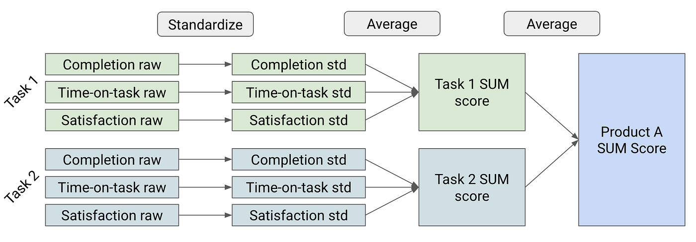
Second, the SUM allows a practitioner to reliably sum up metrics from every sub-metric of every task to a single overall value for a product or experience. For example, a four-task study would have 12 sub-metrics but a final SUM score that is a single number. This single number can show a product’s usability at a glance. Any SUM score below 50% is relatively poor and anything above 50% is relatively good. There is more nuance to that but for now remember poor < 50%, good ≥ 50%.
The SUM is a robust and extremely useful method for UX benchmarking. If you want a deeper dive on how I applied the SUM, check out my case study via a Red Hat conference.
How the Sum Works
Score Standardization
Each metric in the SUM has to be taken in its raw form and turned into a standard score so that all disparate sub-measures can be mathematically combined into an average for a task-level SUM score. For example, in the satisfaction survey on task 1, let’s say the mean response is 3.5/5. The mean time-on-task for task 1 is 60 seconds. How do we combine 60 seconds and 3.5/5? We standardize each of them separately, and the resulting score is called a standard score or z-score. These standard scores can then be averaged together to get a task-level SUM score.
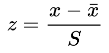
The standardization process involves subtracting the mean from a specification limit and dividing that value by the standard deviation. The tricky part can be finding out what the specification limit should be.
I used R to analyze this problem (full reproducible script), so here is the formula I used in R:
z = (mean(data) — spec) / sd(data)The standard score is represented as a z-value. This can be confusing for stakeholders, so the authors recommend converting this z-value to a percentage format. I agree with this conversion and it’s quite easy to do in R.
SUM.value <- pnorm(z)How to standardize each metric
Here is what a summary of the data look like that we’ll rely on for our examples:
Task 1 metrics
+--------------+------+---------+---------+
|   Measure    | Mean | StdDev  | Spec    |
+--------------+------+---------+---------+
| Satisfaction |  3.5 |    1.10 |    4.00 |
| Time-on-task | 75.0 |   50.00 |   60.00 |
| Completion   |   .6 |     ?   |    0.78 |
+--------------+------+---------+---------+
For satisfaction, this is straightforward across any study. Research has shown that 4/5 is a good usability score on a Likert scale. Therefore, we want to assign all scores at or above 4 a relatively positive value and scores below 4 a relatively negative value.
#get standard score
(3.5 - 4) / 1.1
> -.45
#convert z-value to percentage
pnorm(-.45)
> .32
Our satisfaction SUM value for task 1 is 32%. That is below 50% so it is a poor score. This aligns with our specification idea that anything below 4 should be represented as relatively poor.
For time-on-task, it’s a little more complicated. We have to choose a bespoke specification time for each task: we wouldn’t expect liking a tweet to take the same amount of time as adjusting your Twitter privacy settings. There are many ways to do this that I won’t cover now, but MeasuringU has a lot more information. Once do have the specification limit (60 seconds for us), we use the same approach as for satisfaction but inverting the final percentage (because smaller is better for time measurements).
#get standard score
(75 - 60) / 50
> .3
#convert z-value to percentage and subtract from 1
1 - pnorm(.3)
> .38
Our time-on-task SUM value for task 1 is 38%. This is also below 50% so it is a poor score. Because we want users to take 60 seconds but they took 75 seconds, this poor score makes sense.
For completion, the standardization is straightforward (or is it?). The specification for completion is 78% (based on more MeasuringU research). Curiously, the SUM method proposes we ignore the completion rate specification because the mean of a completion rate is already a proportion. We use the proportion (mean) that we have based on successes compared to all collected participant trials.
#get mean
.60
> .60
Our completion SUM value is 60%. This is above 50% so it is a good SUM score. But, this is below our specification of 78% so we should have a poor SUM score. We don’t want to falsely indicate that our completion rate on task 1 was good, when it was, in fact, below the specification value. This is what amounts to a positive bias for completion rates, most critically in the range of .5 to .78.
The way we calculate completion rates in the SUM approach has a positive bias.
This was a clear problem in my use of the SUM. What is most valuable about the SUM is the ability to take an absolute value and correctly assign a positive or negative quality to it. With that underlying principle broken in completion rates, it reduced the usefulness of the SUM for my work.
The completion bias and how to fix it
The completion bias is a tradeoff the authors made for complexity — it’s very simple to just take the basic completion rate proportion as is. It’s not inherently bad or good as all models have bias. However, based on my goal of quickly assigning a positive or negative quality to a completion rate, this bias made the SUM less useful.

This completion rate standardization can be improved in two possible ways.
Using Bernoulli variance
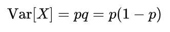
So, when we follow the original SUM method, why does our completion rate come out with a bias? The most obvious reason is that we dropped out the use of the specification, the key aspect of standardizing our disparate measures. To incorporate the specification of 78%, we use the variance from a Bernoulli distribution as the variance for the completion rate.
Applying this variance to the standardization process allows us to resolve the completion rate bias.
#Bernoulli variance
.6/(1-.6)
> .2
#get standard score
(.6 - .78) / .2
> -.9
#convert z-value to percentage
> 0.1840601
Our completion SUM value is now 18%. This is below 50% so it is a poor SUM score. This makes sense: our completion rate is below the specification value of 78% so the SUM value should be poor and is with this approach.
This works for our example, but does it work for other proportions as well?
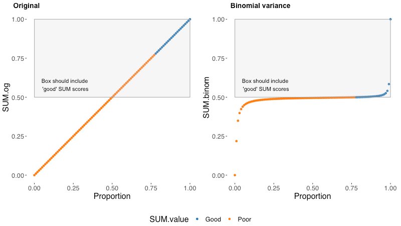
I created a dataset in R that includes all possible proportions rounded to the percent (0, .01, .02, .03…). Using Bernoulli variance, this is easy to do without fully simulating datasets because variance is fixed based on the proportion, not sample size (check the formula above, it does not include n).
On the left, we can see each possible value of the original SUM completion score plotted along the base proportions of a measured completion rate (spoiler: they are the same number, .47 in a completion rate has a SUM value of .47). On the right, we can see each possible value of the new Bernoulli variance completion score plotted along the base proportions of a measured completion rate.
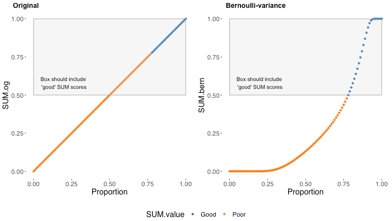
Blue dots are good SUM scores and orange dots are poor SUM scores. An accurate SUM value will have all and only good/blue values in the box. In the original SUM formulation, we can see all values between .5 and .78 are poor/orange but still in the box that should only contain good/blue. This is ultimately the bias that the original method contains. Any completion rate between .5 and .78 will contribute an artificially positive value to the task level SUM scores. Values near and above .78 will also be artificially high.
In the Bernoulli variance approach, all good/blue values are in the box and all poor/orange values are outside of the box. In this way, the Bernoulli approach is accurate to the specification that .78 is a good completion rate. This model is also biased in its own way (all models are wrong…). We can see that this approach flattens out the low and high extreme values into a light-tailed distribution — this makes our model less discriminating at extreme proportions. It also uses Bernoulli variance when the distribution of a completion rate in a usability test is technically binomial¹.
Between these two options, we have to pick our poison.
- The original model has artificially high scores for a very common range of completion rates around the specification value of .78.
- The Bernoulli variance model is not very discriminating for values near 0 (within ~ .25) and values very near 1 (within ~.1).
Any sufficiently complicated statistical process has a lot of decision points. Personally, I’m less concerned with differentiating .9 and .97 (both are extremely good scores) than I am with accurately reporting that a score of .6 is not a good score for completion rates.
Using polynomial interpolation
There is one more approach we could use that is very simple, despite the fancy name. Polynomial means our equation will have more than two variable terms (the line bends). Interpolation means we crudely draw the line from point to point, rather than smoothing, so the line has a sharp angle.
We can be brutally simple and just spread out the proportions between 0 and .78 to fit between 0 and .5. We do this for values from 0 to .78 by finding how to convert .78 to .5 and extending that formula to the other values (x * .5 / .78).
We also spread out the proportions between .78 and 1 to fit between .5 and 1. We do this with some inversion to constrain our results to have a ceiling at 1. We take the inverse proportion of .78 to get .22 and the inverse proportion of x. Then we re-invert the final value to put it back to its original scale of .78–1: (1 – (1- x) * (.5 / .22)).
Ultimately, there are two functions² based on the score being good or poor as dictated by the specification value of .78.
#our value is .6, so we use this for all values below .78
.6 * (.5/.78)
> .38
Our completion SUM value is 38%. This is below 50% so it is a poor SUM score, in alignment with .6 being below the completion specification level of .78.
Again, on the left, we can see each possible value of the original SUM completion score plotted along the base proportion of a measured completion rate. On the right, we can see each possible value of the polynomial interpolation completion score plotted along the base proportion of a measured completion rate.
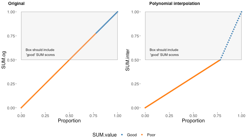
The polynomial interpolation method is another way to ensure all good/blue completion rate proportions have SUM scores above .5 and all poor/orange completion rate proportions have SUM scores below .5.
This approach avoids the inaccuracy of the original SUM approach and the light-tailed nature of the Bernoulli approach. Still, as made clear by the graph, this method is crude and will likely introduce some more error in certain situations based on using interpolation over regression. I’m still investigating what this error would be and if it would perform differently than the bias of the original SUM approach. Overall, I would still take this approach over the original.
Wrapping up
The SUM is a robust and useful method in the toolkit of a quantitative UX researcher. The completion rate bias detracts from the impact a SUM score can provide by quickly and accurately assigning a useful quality judgment to a usability study metric. The two methods I outlined have downsides but improve upon an already solid method.
The Bernoulli variance approach uses the same z-score standardization method for completion rates as time-on-task and satisfaction. It improves upon reporting poor scores falsely as good. This is in exchange for weaker differentiation on extremely negative or positive completion rates.
The polynomial interpolation approach does not use the typical z-score transformation to standardize, but relies on two simple algebraic functions to transform the values above and below the specification value. This method also improves upon reporting poor scores falsely as good, and does not largely compress variance across the possible completion rate proportions.
If you’re using the SUM, consider the benefits of using the Bernoulli variance or polynomial interpolation approaches to enhance the accuracy of completion rates in your calculations.
Appendix
- Bernoulli variance vs. Binomial variance
Technically, a completion rate is a series of Bernoulli (yes/no) trials, which makes it a binomial distribution. Attempting to use the binomial variance (npq) rather than the Bernoulli variance (pq) massively compresses the variance amongst ‘mid’ proportion values, essentially rendering the standardization useless. (Note: I used n=100 for this simulation.)
If anyone has a thought as to why it’s okay (or not) to extend Bernoulli variance to the mean of a binomial distribution from a technical/theoretical standpoint, please let me know.
2. The polynomial interpolation function in R
If you want to use the polynomial interpolation function, it’s fairly simple but didn’t fit well in the above narrative.
#This is a function that creates completion rate standardization from polynomial interpolation
#b is the benchmark value which defaults to .78 but can be overridden with a custom valuepolyint <- function(x,b=.78) {
  stopifnot(x >= 0 & x <= 1) #only take proportion values
  ifelse(

    x>=b,
    1 - (1-x) * (.5/ (1-b)), #if at or above .35
    x *.5/b) #if below .35
}
Leave a Reply