When was the last time you got a confusing survey from a company or app? If you’re a UX researcher, did you screenshot to discuss with your coworkers (like I always do)?
Here is an in-app survey I got from TikTok that made me feel confused: why were the emojis in black and white? What did each really mean? Am I too uninformed to know what precise emotion is being conveyed? I felt like TikTok expected me to know something that I didn’t or couldn’t know.

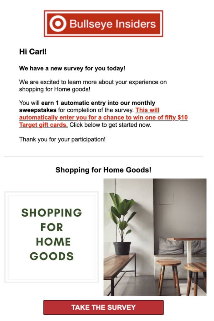
Here is an email that I get from Target about every two days. I haven’t taken a survey in months, but they send me an email every two days to invite me (I really should unsubscribe). I felt like Target was spammy for repeatedly inviting me to something I’ve shown a clear disinterest in, even though I signed up for it.

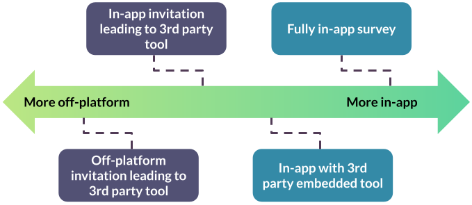
What do both of these have in common, even though one of these surveys is in the app itself and the other is in an email and links to a third party survey platform? My feelings towards the companies are diminished, though one isn’t in the app at all. It’s tempting to think of surveys as something unrelated to a user’s experience, but across the spectrum of in-app to off-platform, surveys impact your user’s experience, positively or negatively.

Regardless of how you send surveys, they are influencing your user’s experience directly. I’ve never once heard someone exclaim how much they dislike Qualtrics when a major retailer sends them a confusing survey – the feelings are always directed at the company or organization, not the tooling vendor.
(Note: my intent is not to disparage any researchers and their work. I don’t know the operations and goals of these surveys – they may very well accomplish what they set out to. I am simply giving my opinion as an N of 1 for the sake of example.)
Users don’t clearly differentiate what is part of the “UX”
Let’s zoom out for a second. What is user experience? According to NNGroup, it “encompasses all aspects of the end-user’s interaction with the company, its services, and its products.”
You’ll notice that the definition doesn’t differentiate research itself from the product a company sells, when it involves user interaction. Whether a survey or interview with a user, all of those interactions weigh into users’ feelings and perceptions of your product/organization’s user experience.
In the product world, we have a tendency to equate the user experience with the pixels designers craft and engineers ship. If we’re thinking bigger, we also start to include things like customer service or the way the backend infrastructure serves content. Research processes fit into this bigger circle as well. As researchers, we have blindspots to how our own work directly creates a user’s experience – we’re not used to flipping the focus of user evaluation onto our own processes.
Bad research is a bad user experience
When users are invited for an interview, the way that we treat those participants will influence how they think of the company or app, even if they never touch the app while in the interview process. You can imagine if the interviewer is late, rude, and asks them prying questions, the user would be much less likely to use the company’s product.
The same goes for surveys. If your survey is broken or rude, users will think negatively of the company, not the survey in isolation. This is the opposite of the halo effect, sometimes called the horn effect.
In a classic horn effect example, if someone judges another person negatively in one domain (say, attractiveness), they will judge them more negatively in unrelated domains (say, intelligence). This extends to the experience of products – the perception of one part of a user experience will influence all other perceptions of that user experience.
Surveys have the potential to impact many users
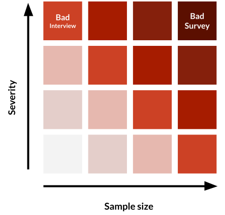
Surveys in particular are a risk to a company’s user experience. While a bad interview can really ruin one or a handful of users’ experience with a product, this impact is smaller than that of a survey by orders of magnitude. Surveys can quickly impact thousands or hundreds of thousands of users.

Your survey could have a small problem, but now thousands of users have seen this problem, magnifying the implications of a small mistake. Your survey could have a large problem – this is the worst of both worlds (severity and sample size). For these reasons, it’s critical to watch for common mistakes.
Common problems to avoid
There are a few frequent problems I see in surveys in the wild (my own work included). These also apply differently depending on where the survey falls on the in-app/off-platform survey spectrum.
- Sending invites too frequently: be sure you consider how your survey pool is affected by fatigue.
- Surveys are too long: consider the motivation of your users (incentives, passion, etc.) and how that affects what time/effort they’re willing to put in.
- Asking questions that don’t make sense: build in time to cognitively test your survey so questions are clear to respondents.
- Broken programming: make sure branches lead to logical places, pipe-through text is working, and media displays properly.
Plan for mistakes
Unlike interviews, surveys involve a technical programming step. And, once a survey is launched, it’s extremely difficult to adjust. (If you do, you’ll almost certainly disqualify previous data from being included in the final analysis sample).
Knowing mistakes are inevitable, so we need set up processes that will catch those mistakes before they have an impact on users. Here are just a couple ways I have approached this across different teams.
Quick team feedback: the easiest way to get started on improving your surveys is to ask your team members for feedback. You may already do this at the planning phase or deliverable phase. By adding this step at the programming phase, you can catch any errors that may affect your users’ experiences (and your data quality).
Survey review group: you can formalize this process more by creating a dedicated working group to review all surveys before launch. If you have a small team, this probably isn’t necessary. As teams grow and other functions start to create surveys (product marketing, community outreach, product managers, etc.), it becomes more important to review surveys beyond your own. This is also critical when your survey is using an in-app tool – bugs are more likely than in a standalone survey product and proximity to the core user experience is high.
Cognitive testing: the focus of cognitive testing is primarily on the content of the questions, but you will surely catch general survey errors if you test with the survey instrument.
Wrap up
The research we do is part of our user experience, and surveys have the potential to negatively impact the UX of many users. To reduce any research team’s harm to the user experience, we need to implement processes that catch mistakes before surveys go live. Find a way to implement a quality check that works for your research and your team.